CSS Guidelines
High-level advice and guidelines for writing sane, manageable, scalable CSS
In working on large, long-running projects, with dozens of developers of differing specialities and abilities, it is important that we all work in a unified way in order to—among other things—
- keep stylesheets maintainable;
- keep code transparent, sane, and readable;
- keep stylesheets scalable.
There are a variety of techniques we must employ in order to satisfy these goals.
- CSS Guidelines
- Tables of contents
- Syntax and formatting
- Titling
- Multi-line CSS
- Indenting
- Meaningful Whitespace
- Commenting
- Object–Extension Pointers
- Removing Comments
- Naming standard
- BEM-like Naming
- Modifying Elements
- JavaScript Hooks
- CSS Selectors
- Reusability
- Location Independence
- Portability
- Naming
- Naming UI Components
- Selector Performance
- IDs in CSS
- General Rules
- CSS modules
- In practice
- Namespaces
- Object Namespaces: o-
- Component Namespaces: c-
- Utility Namespaces: u-
- Scope Namespaces: s-
- Stateful Namespaces: is-/has-
- Javascript Namespaces: js-
- QA Namespaces: qa-
- Using our SCSS
Syntax and formatting
At a very high-level, we want
- four (4) space indents, no tabs;
- multi-line CSS;
- meaningful use of whitespace.
Consistency is key.
It is a good idea to split discrete chunks of code into their own files, which are concatenated during a build step.
Titling
Begin every new major section of a CSS project with a title:
//‐‐‐‐‐‐‐‐‐‐‐‐‐‐‐‐‐‐‐‐‐‐‐‐‐‐‐‐‐‐‐‐‐‐‐‐
//   #SECTION‐TITLE
//‐‐‐‐‐‐‐‐‐‐‐‐‐‐‐‐‐‐‐‐‐‐‐‐‐‐‐‐‐‐‐‐‐‐‐‐

.selector {}
If you are working on a project where each section is its own file, this title should appear at the top of each one. If you are working on a project with multiple sections per file, each title should be preceded by five (5) carriage returns. This extra whitespace coupled with a title makes new sections much easier to spot when scrolling through large files.
Multi-line CSS
CSS should be written across multiple lines. This reduces the chance of merge conflicts, because each piece of functionality exists on its own line. There will also be more ‘truthful’ and reliable diffs, because one line only ever carries one change.
Indenting
As well as indenting individual declarations, indent entire related rulesets to signal their relation to one another, for example:
.foo {}
    .foo__bar {}
        .foo__baz {}
By doing this, a developer can see at a glance that .foo__baz {} lives inside .foo__bar {} lives inside .foo {}.
This quasi-replication of the DOM tells developers a lot about where classes are expected to be used without them having to refer to a snippet of HTML.
Meaningful Whitespace
As well as indentation, we can provide a lot of information through liberal and judicious use of whitespace between rulesets. We use:
- One (1) empty line between closely related rulesets.
- Two (2) empty lines between loosely related rulesets.
- Five (5) empty lines between entirely new sections.
Commenting
The cognitive overhead of working with CSS is huge. With so much to be aware of, and so many project-specific nuances to remember, the worst situation most developers find themselves in is being the-person-who-didn’t-write-this-code. Remembering your own classes, rules, objects, and helpers is manageable to an extent, but anyone inheriting CSS barely stands a chance.
CSS needs commentsHigh-level
Like Sass, SCSS supports both comments that are preserved in the CSS output and comments that aren’t. However, SCSS’s comments are significantly more flexible. It supports standard multiline CSS comments with /* */, which are preserved where possible in the output.
SCSS also uses // for comments that are thrown away, like Sass. Unlike Sass, though, // comments in SCSS may appear anywhere and last only until the end of the line.
We prefer // for commentsObject–Extension Pointers
When working across multiple partials, or in an OOCSS manner, you will often find that rulesets that can work in conjunction with each other are not always in the same file or location. For example, you may have a generic button object—which provides purely structural styles—which is to be extended in a component-level partial which will add cosmetics. We document this relationship across files with simple object–extension pointers. In the object file:
//
// Extend `.btn {}` in _components.buttons.scss.
//
.btn {}
Removing Comments
It should go without saying that no comments should make their way into production environments—all CSS should be minified, resulting in loss of comments, before being deployed.
Naming Standard
A good naming standard will tell you and your team
- what type of thing a class does;
- where a class can be used;
- what (else) a class might be related to.
Hyphen Delimited
All strings in classes are delimited with a hyphen (-), like so:
.page‐head {}
    .sub‐content {
Camel case and underscores are not used for regular classes.
BEM-like Naming
BEM – meaning block, element, modifier – is a front-end naming methodology.
- Block: The sole root of the component.
- Element: A component part of the Block.
- Modifier: A variant or extension of the Block.
BEM is a highly useful, powerful and simple naming convention to make your front-end code easier to read and understand, easier to work with, easier to scale, more robust and explicit and a lot more strict.
The BEM approach ensures that everyone who participates in the development of a website works with a single codebase and speaks the same language. Using proper naming will prepare you for the changes in design of the website.
This naming convention follows this pattern:block {}
.block__element {}
.block‐‐modifier {}- .block represents the higher level of an abstraction or component.
- .block__element represents a descendent of .block that helps form .block as a whole.
- .block--modifier represents a different state or version of .block.
The reason for double rather than single hyphens and underscores is so that your block itself can be hyphen delimited, for example:
.site‐search {} // Block
.site‐search__field {} // Element
.site‐search‐‐full {} // Modifie
And HTML:
<form class="site‐search  site‐search‐‐full">
    <input type="text" class="site‐search__field">
    <input type="Submit" value ="Search" class="site‐search__button">
</form>
Modifying Elements
You can have variants of Elements, and these can be denoted with double hyphens.
. site‐search__field‐‐large {Here we can see we’re directly modifying the field Element.
JavaScript Hooks
As a rule, it is unwise to bind your CSS and your JS onto the same class in your HTML. Typically, these are classes that are prepended with js-, for example:
<input type="submit" class="btn js‐btn" value="Follow" />This means that we can have an element elsewhere which can carry with style of .btn {}, but without the behaviour of .js-btn
This is importantdata-* Attributes
A common practice is to use data-* attributes as JS hooks, but this is incorrect. data-* attributes, as per the spec, are used to store custom data private to the page or application.
CSS Selectors
It is important when writing CSS that we scope our selectors correctly, and that we’re selecting the right things for the right reasons.
For example, if you want to style your website’s main navigation menu, a selector like this would be unwise.
header ul {}This selector’s intent is to style any ul inside any header element, whereas our intent was to style the site’s main navigation.
A better approach would be a selector like:
.site‐nav {}We are explicitly selecting the right thing for exactly the right reason.
Your selectors should be as explicit and well-reasoned as your reason for wanting to select something.
Reusability
With a move toward a more component-based approach to constructing UIs, the idea of reusability is paramount. We want the option to be able to move, recycle, duplicate, and syndicate components across our projects.
Location Independence
Given the ever-changing nature of most UI projects, and the move to more component-based architectures, it is in our interests not to style things based on where they are, but on what they are. That is to say, our components’ styling should not be reliant upon where we place them—they should remain entirely location independent.
For example:
.promo a {}This is a greedy style selector and every link inside of a .promo to look like a button—it is also pretty wasteful as a result of being so locationally dependent: we can’t reuse that button with its correct styling outside of .promo because it is explicitly tied to that location. A far better selector would be:
.btn {}A component shouldn’t have to live in a certain place to look a certain way.
Portability
Reducing, or, ideally, removing, location dependence means that we can move components around our markup more freely.
Take the following example:
input.btn {}This is a qualified selector; the leading input ties this ruleset to only being able to work on input elements. By omitting this qualification, we allow ourselves to reuse the .btn class on any element we choose, like an a, for example, or a button.
Qualified selectors do not lend themselves well to being reused, and every selector we write should be authored with reuse in mind.
Naming
Pick a name that is sensible, but somewhat ambiguous: aim for high reusability. For example, instead of a class like .site-nav, choose something like .primary-nav; rather than .footer-links, favour a class like .sub-links. Our preference is BEMIT naming convention.
The differences in these names are that the first of each two examples is tied to a very specific use case: they can only be used as the site's navigation or the footer’s links respectively. By using slightly more ambiguous names, we can increase our ability to reuse these components in different circumstances.
Classes like .border or .red are never advisable—but we should avoid using classes which describe the exact nature of the content and/or its use cases.
Using a class name to describe content is redundant because content describes itself.
//
// Runs the risk of becoming out of date; not very maintainable.
//
.blue {
    color: blue;
}
//
// Depends on location in order to be rendered properly.
//
.header span {
    color: blue;
}
//
// Too specific; limits our ability to reuse.
//
.header‐color {
    color: blue;
}
//
// Nicely abstracted, very portable, doesn’t risk becoming out of date.
//
.highlight‐color {
    color: blue;
}
Naming UI Components
Naming components with agnosticism and reusability in mind really helps developers construct and modify UIs much more quickly, and with far less waste.
<ul class="tabbed‐nav">Selector Performance
Generally speaking, the longer a selector is (i.e. the more component parts) the slower it is, for example:
body.home div.header ul {}…is a far less efficient selector than:
.primary‐nav {}IDs in CSS
Avoid using IDs in CSS
Not only are IDs inherently non-reusable, they are also vastly more specific than any other selector, and therefore become specificity anomalies.
General Rules
Your selectors are fundamental to writing good CSS.
To very briefly sum up:
- Select what you want explicitly, rather than relying on circumstance or coincidence. Write selectors for reusability, so that you can work more efficiently and reduce waste and repetition.
- Do not nest selectors unnecessarily, because this will increase specificity and affect where else you can use your styles.
- Do not qualify selectors unnecessarily, as this will impact the number of different elements you can apply styles to.
- Keep selectors as short as possible, in order to keep specificity down and performance up.
CSS modules
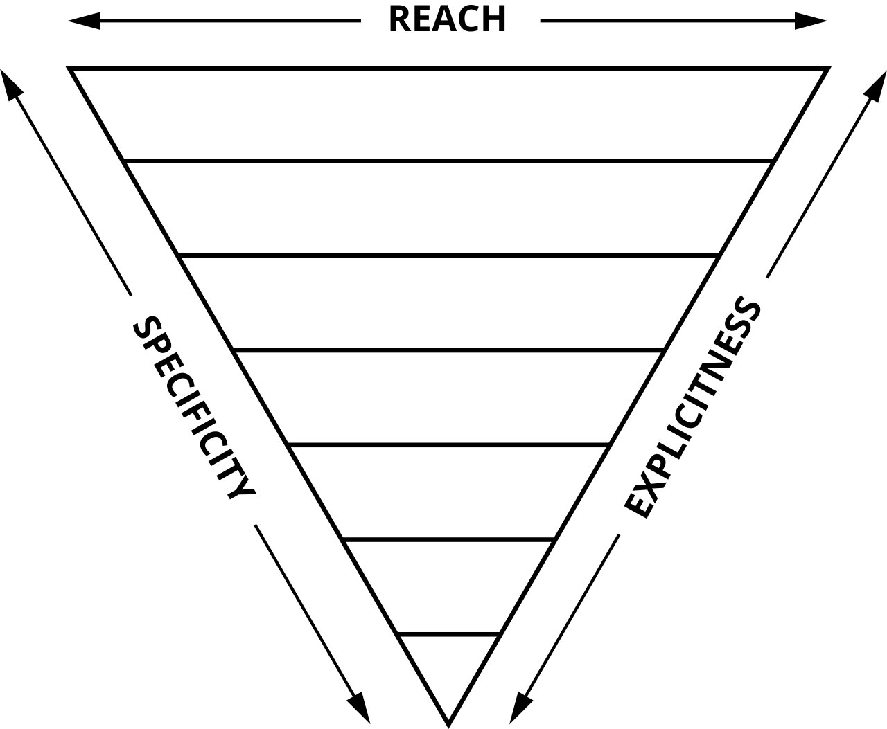
Our methodology towards CSS projects is a variation to ‘ITCSS' by Harry Roberts. It’s very similar with some minor amendments. Another blog post about ITCSS. One of the key principles of ITCSS is that it separates your CSS codebase to several sections (called layers), which take form of the inverted triangle: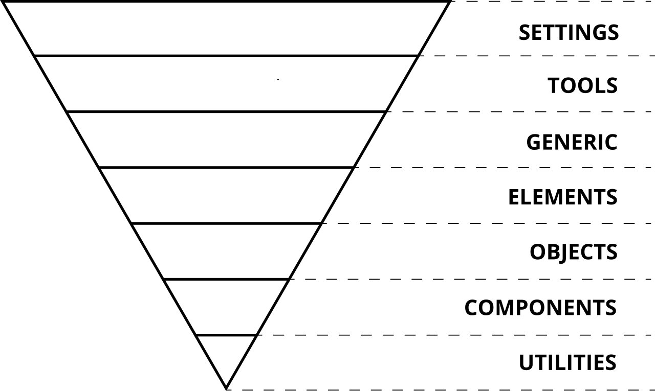
Our default layers:
- Settings – used with preprocessors and contain font, colours definitions, etc.
- Tools – globally used mixins and functions. It’s important not to output any CSS in the first 2 layers.
- Generic – reset and/or normalize styles, box-sizing definition, etc. This is the first layer which generates actual CSS.
- Elements – styling for bare HTML elements (like H1, A, etc.). These come with default styling from the browser so we can redefine them here.
- Objects – class-based selectors which define undecorated design patterns, for example media object known from OOCSS
- Components – specific UI components. This is where majority of our work takes place and our UI components are often composed of Objects and Components
- Overrides – utilities and helper classes with ability to override anything which goes before in, eg. hide helper class
The triangle also shows how styles represented by selectors are ordered in the resulting CSS: from generic styles to explicit ones, from low-specificity selectors to more specific ones (but still not too specific, IDs are not allowed) and from far reaching to localized ones.
In practice
Our CSS project main.scss looks like this:
// ‐‐‐‐‐‐‐‐‐‐‐‐‐‐‐‐‐‐‐‐‐‐‐‐‐‐‐‐‐‐‐‐‐‐‐‐
//   #MAIN
// ‐‐‐‐‐‐‐‐‐‐‐‐‐‐‐‐‐‐‐‐‐‐‐‐‐‐‐‐‐‐‐‐‐‐‐‐
//
//  CONTENTS
//
//  SETTINGS
//  Config...............Configuration and environment settings.
//  Global...............Globally‐available variables and
settings/config.
//  Colors...............Manage our color palette in isolation.
//
//  TOOLS
//  Functions............Some simple helper functions.
//  Mixins...............Globally available mixins.
//  Aliases..............Some shorter aliases onto longer variables.
//
//  GENERIC
//  Normalize.css........A level playing field.
//  Box‐sizing...........Better default `box‐sizing`.
//  Reset................A pared back reset to remove margins.
//
//  ELEMENTS
//  Page.................Page‐level styles (HTML element).
//  Headings.............Heading styles.
//  Text.................Text styles.
//  Links................Hyperlink styles.
//  Lists................Default list styles.
//  Images...............Base image styles.
//  Quotes...............Styling for blockquotes, etc.
//  Forms................Styling for forms.
//  Tables...............Styling for tables, etc.
//
//  OBJECTS
//  Wrappers.............Wrappers and page constraints.
//  Flexboxgrid..........Flexbox grid.
//  Media................The media object.
//  List‐bare............Lists with no bullets or indents.
//  List‐inline..........Simple abstraction for setting lists out in a
line.
//  Crop.................A container for cropping image and media
content.
//
//  COMPONENTS
//  Logo.................Make our logo a reusable component.
//  Header...............Page header styles.
//  Footer...............Page footer styles.
//  Nav primary..........The site’s main nav.
//  Nav secondary........Secondary nav styles.
//  Buttons..............Button styles.
//  Accordion............Accordion styles.
//  Tooltip..............Tooltip styles.
//  Pagination ..........Pagination styles.
//  Forms ...............Form styles.
//  Tables ..............Table styles.
//  Links ...............Link styles.
//  Icons ...............Icon styles.
//  Animations ..........Animation styles.
//  Notifications .......Notification styles.
//  Modals ..............Modal styles.
//  Progress Bar ........Progress Bar styles.
//
//  SCOPES
//  Search...............Set up a new styling context for search pages.
//  Content..............Set up a new styling context for content pages.
//
//  OVERRIDES
//  Headings.............Reassigning our heading styles to helper
classes.
//  Widths...............Simple width helper classes.
//  Floats...............Simple float helper classes.
//  Positions............Position modifications.
//  Text sizes...........Text size classes.
//  Colors...............Brand colours.
//  Debug................Visual health‐check tool.
//  Shame.css............Short‐term hacks and quick‐fixes.
//
//  VENDOR OVERRIDES
//  Magnific.............Custom Magnific Popup styles.
//  Flatpickr............Custom datepicker styles.

@import "settings.config";
@import "settings.global";
@import "settings.colors";
@import "tools.functions";
@import "tools.mixins";
@import "tools.typography";
@import "tools.aliases";
@import "generic.normalize";
@import "generic.box‐sizing";
@import "generic.reset";
@import "elements.page";
@import "elements.headings";
@import "elements.text";
@import "elements.links";
@import "elements.lists";
@import "elements.images";
@import "elements.quotes";
@import "elements.forms";
@import "elements.tables";
@import "objects.flexboxgrid";
@import "objects.wrappers";
@import "objects.media";
@import "objects.list‐bare";
@import "objects.list‐inline";
@import "objects.crop";
@import "components.logo";
@import "components.header";
@import "components.breadcrumbs";
@import "components.footer";
@import "components.nav‐primary";
@import "components.nav‐secondary";
@import "components.buttons";
@import "components.accordion";
@import "components.tooltip";
@import "components.pagination";
@import "components.forms";
@import "components.tables";
@import "components.links";
@import "components.icons";
@import "components.animations";
@import "components.notifications";
@import "components.modals";
@import "components.progress‐bar";
@import "scope.search";
@import "scope.content";
@import "scope.search";
@import "scope.results";
@import "overrides.headings";
@import "overrides.widths";
@import "overrides.floats";
@import "overrides.positions";
@import "overrides.textsizes";
@import "overrides.colors";
@import "overrides.debug";
@import "overrides.shame";
@import "vendor/tablesaw";
@import "vendor/magnific‐popup";
@import "vendor/flatpickr";
@import "overrides.vendor.magnific";
@import "overrides.vendor.flatpickr";
Namespaces
Related to how we modularise our CSS, here is descriptive list of the namespaces we use:
- o-: Signify that something is an Object, and that it may be used in any number of unrelated contexts to the one you can currently see it in. Making modifications to these types of class could potentially have knock-on effects in a lot of other unrelated places. Tread carefully.
- c-: Signify that something is a Component. This is a concrete, implementation-specific piece of UI. All of the changes you make to its styles should be detectable in the context you’re currently looking at. Modifying these styles should be safe and have no side effects.
- u-: Signify that this class is a Utility class. It has a very specific role (often providing only one declaration) and should not be bound onto or changed. It can be reused and is not tied to any specific piece of UI. You will probably recognise this namespace from libraries and methodologies like SUIT.
- t-: Signify that a class is responsible for adding a Theme to a view. It lets us know that UI Components’ current cosmetic appearance may be due to the presence of a theme.
- s-: Signify that a class creates a new styling context or Scope. Similar to a Theme, but not necessarily cosmetic, these should be used sparingly—they can be open to abuse and lead to poor CSS if not used wisely.
- is-, has-: Signify that the piece of UI in question is currently styled a certain way because of a state or condition. This stateful namespace is gorgeous, and comes from SMACSS. It tells us that the DOM currently has a temporary, optional, or short-lived style applied to it due to a certain state being invoked.
- _: Signify that this class is the worst of the worst—a hack! Sometimes, although incredibly rarely, we need to add a class in our markup in order to force something to work. If we do this, we need to let others know that this class is less than ideal, and hopefully temporary (i.e. do not bind onto this).
- js-: Signify that this piece of the DOM has some behaviour acting upon it, and that JavaScript binds onto it to provide that behaviour. If you’re not a developer working with JavaScript, leave these well alone.
- qa-: Signify that a QA or Test Engineering team is running an automated UI test which needs to find or bind onto these parts of the DOM. Like the JavaScript namespace, this basically just reserves hooks in the DOM for non-CSS purposes.
Object Namespaces: o-
Format
.o‐object‐name[<element>|<modifier>] {}Example
.o‐layout {}
  .o‐layout__item {}
.o‐layout‐‐fixed {}
The o- namespace for Objects is a very useful one for any teams who use Object-Oriented CSS.
OOCSS is fantastic in that it teaches us to abstract out the repetitive, shared, and purely structural aspects of a UI into reusable objects. This means that things like layout, wrappers and containers can all exist as non-cosmetic styles that handle the skeletal aspect of a lot of UI components, without ever actually looking like designed ‘things’.
This leads to much DRYer and drastically smaller stylesheets, but does bring with it one problem: how do we know which classes might be purely structural, and therefore possibly being used in an open-ended number of instances?
This poses problems on projects quite frequently. Picture the following example.
Imagine you’re a developer new to a project, and you have no intimate knowledge of the CSS or what its classes mean or do. You’re asked by a Product Owner to add some padding around the testimonials that appear on the site. You right click, Inspect Element, and you see this:
<blockquote class="media testimonial">Now, it should be fairly clear here that what you should do is go and find the .testimonial {} ruleset in your CSS and add the padding there. However, using DevTools, you find that adding the padding to the .media {} ruleset has exactly the outcome you expected.
The issue here is that .media is an abstraction which, by definition, is a reusable and non-cosmetic design pattern that can underpin any number of different UI components. Sure, altering the padding of it in this instance gave us the desired results, but it also may have just unintentionally broken 20 other pieces of UI elsewhere.
Because objects don’t belong to any one specific component, and can underpin several vastly different components, it is incredibly risky to ever modify one. This is why we should introduce a namespace, to let other developers know that this class forms an abstraction and that any changes here will be reflected in every object site-wide. The object itself does not necessarily have anything to do with the implementation-specific bit of the UI that you are trying to change.
By adding a leading o- to the classes for our objects, we can tell other developers about their universal nature, and hopefully avoid ever having people binding onto them and breaking things. If you ever see a class that begins with o-, alarm bells should ring and you should know to stay well away from it.
<blockquote class="o‐media testimonial">- Objects are abstract.
- They can be used in any number of places across the project—places you might not have even seen.
- Avoid modifying their styles.
- Be careful around anything with a leading o-.
Component Namespaces: c
Format:
.c‐component‐name[<element>|<modifier>] {}Example:
.c‐modal {}
  .c‐modal__title {}
.c‐modal‐‐gallery {}
Components are some of the safest types of selectors we will encounter. Components are finite, discrete, implementation-specific parts of our UI that most people (users, designers, developers, the business) would be able to identify: This is a button; This is the date picker; etc.
Usually when we make changes to a Component’s ruleset, we will immediately see those changes happening every- (and only) where we’d expect. Unlike with Objects, changing the padding on the .c-modal__content should not affect anything else in the site other than the content area of our modal. Where Objects are implementation-agnostic, Components are implementation-specific.
If we revisit the previous example, and introduce the Object and Components’ namespaces, we’d be left with this:
<blockquote class="o‐media  c‐testimonial">
</blockquote>
Now I can tell purely from this HTML that any changes I make to the .o-media class may be felt throughout the entire site, but any changes I make to the .c-testimonial ruleset will only modify testimonials, and nothing else.
- Components are implementation-specific bits of UI.
- They are quite safe to modify.
- Anything with a leading c- is a specific thing.
Utility Namespaces: u
Format:
.u‐utility‐name {}Example:
.u‐clearfix {}Utilities are complete single responsibility rules which have a very specific and targeted task. It is also quite common for these rules’ declarations to carry !important so as to guarantee they beat other less specific ones. They are to be used as a last resort when no other CSS hooks are available, or to tackle completely unique circumstances, e.g. using .u-text-center to centrally align one piece of text once and once only.
Because of their heavy-handed approach, their global reusability, and their exceptional use-case, it is incredibly important that we signal Utilities to other developers. We do not want anyone trying to bind onto these in future selectors.
footer .text‐center {
  font‐size: 75%;
}
Here we can see a problem: the .text-center class now has two responsibilities when it appears anywhere inside .footer. It now has side effects, which are something that Utilities should never, ever have.
By using a namespace, we can introduce a simple and unbreakable rule: if it begins with u-, never reassign to it.
Utilities should be defined once, and never need changing.
Scope Namespaces: s
Format:
.s‐scope‐name {}Example:
.s‐cms‐content {}Scoped contexts in CSS solve a very specific and particular problem: please be entirely certain that you actually have this problem before employing Scopes, because they can be misused and end up leading to actively bad CSS.
Often times it can be useful to set up a brand new styling context for a particular section of your UI. A perfect example of this is areas of user-generated content, where some long-form/prose HTML has come from a CMS.
Stateful Namespaces: is-/has
Format:
.[is|has]‐state {}Example:
.is‐open {}
.has‐dropdown {}
Stateful namespaces come from SMACSS, and they tell us about short-lived or temporary states of the UI that need styling accordingly.
When looking at a piece of interactive UI (e.g. a modal overlay) through developer tools, we’ll probably spend some time toggling things on and off. Being able to see classes like .is-open appear and disappear in the DOM is a highly readable and very obvious way of learning about state:
<div class="c‐modal  is‐open">
  ...
</div>
It’s also incredibly handy in our CSS to tell people possible states that a piece of UI can exist in, for example:
.c‐modal {
  ...
  &.is‐open { ... }
}
  .c‐modal__content {
    ...
    &.is‐loading { ... }
  }
These classes work by chaining other classes, for example .c-modal.is-open. This heightened specificity ensures that the State always takes prominence over the default styling. It also means that we would never see a bare Stateful class on its own in a stylesheet: it must always be chained to something.
Javascript Namespaces: js
Format:
.js‐component‐name {}Example:
.js‐modal {}JavaScript namespaces are pretty common now, and most people tend to use them. The idea is that—in order to properly separate our concerns—we should never have styling and behaviour bound to the same hooks. To bind both technologies onto the same hook means we can’t have one without the other: our UI becomes all-or-nothing, which makes it very opinionated and inflexible.
It’s probably also worth noting that because the JS namespace has nothing at all to do with CSS, its format should be determined by your JS engineers. If your JS team’s naming convention for variables etc. is camel case, then they should be allowed to choose JS hooks like .jsModal if they so desire.
- JavaScript and CSS are separate concerns—use separate hooks for them.
- Giving different teams/roles different hooks makes for safer collaboration.
QA Namespaces: qa
Format:
.qa‐node‐name {}Example:
.qa‐error‐login {}An unusual, but potentially very useful namespace is this one, for your QA team. When running automated UI tests with something like Selenium, or a headless browser, it is quite common to do something like:
- Visit site.dev/login
- Enter an incorrect username. li>Enter an incorrect password.
- Expect to see an error appear in the DOM.
Automated UI tests shouldn’t be binding onto CSS classes. Eg. c-message--error. QA team should bind onto a suite of their own classes that do not have CSS attributes.
<strong class="c‐message c‐message‐‐error qa‐error‐login">Styling of c-message--error is separated from QA hooks and we have a separation of concerns.
Using our SCSS
If you’re a developer looking to use our SCSS project there are a few recommendations:
- Follow the general guidelines in this document
- Keep your SCSS modular
- Extend our components, rather than modify them
- Label your SCSS files with your product name
Following these general rules will allow you to work alongside our team on the SCSS project, but also not stop you from creating modifications or customisations. Future releases of our SCSS project will easily drop in as upgrade paths are maintained. Modifying core parts of our SCSS project (eg. elements, objects and components) should not be considered as this would hinder maintainability.
Extending components
Each section of our CSS ‘inverted triangle’ has an equivalent namespace layer.
Within components we have this stylesheet:
_components.icons.scssThe purpose of this component is to control the presentation and structure of icons in our SCSS project. There are a number of reusable classes to control the size, positioning and source of SVG icons on any element.
Extract from stylesheet:
...
$icon‐size: 1rem; //default size
...
$icon‐reset‐blue: "c‐icon__reset‐‐blue.svg";
...
.c‐icon {
...
    &‐‐large {
        background‐size: $icon‐size‐large auto;
        ...
    }
...
}
...
If you find our current selection of icons or attributes lacking for your project, we recommend that you add classes to a new stylesheet that references any of our selectors without duplicating attributes.
Example:
You need an extra-extra-large icon size that doesn’t exist in our component
_components.yourproductname.icons.scssWould contain:
//This stylesheet extends components.icons.scss
.c‐icon {
  &‐‐xxlarge {
     background‐size: $icon‐size‐large * 3 auto;
  }
}
This method can be used at any layer and your main.scss should be updated appropriately. You may end up adding new entries for further changes you make, for example:
...
@import "settings.yourproduct";
...
@import "tools.yourproduct";
...
@import "elements.yourproduct.forms";
...
@import "objects.yourproduct.wrappers";
...
@import "components.yourproduct.icons";
@import "components.yourproduct.tables";
...
@import "overrides.yourproduct.headings";
...
@import "overrides.yourproduct.vendor.magnific";
...
It may seem a bit onerous to abstract your modifications/additions like this, however this will allow future upgrades to our core SCSS in your project without losing changes specific for your product.
This abstraction will also help us understand and easily merge any code you send us for inclusion into our SCSS project.