Layout
Layout style guidelines, implementation and examples are given on this page.
Responsive design
To support all modern browsers and devices the web framework uses snap points and fluid attributes. This solution allows web pages to adapt to variations in device size as well as alter the page layout where needed to achieve the best user experience.
Snap points are handled with mixins and media queries. We have snap points at the following widths:
- Mobile: <40em
- Tablet: 40em to 64em
- Desktop: 64em to 90em
- Desktop+: >90em
Example
Code example
This example is from _settings.global.scss
//Mobile
$media-mobile-from:"(min-width: 0)";
$media-mobile-to:"(max-width: 40em)";

//Tablet
$media-tablet-from:"(min-width: 40.063em)";
$media-tablet-small-to: "(max-width: 51.24em)";
$media-tablet-small-from: "(min-width: 51.24em)";
$media-tablet-to:"(max-width: 64em)";

//Desktop
$media-desktop-from:"(min-width: 64.063em)";
$media-desktop-to:"(max-width: 90em)";

//Large desktop and beyond
$media-desktop-large-from:"(min-width: 90.063em)";

$media-screen-only:"only screen";

//Webkit only query
$media-webkit:"screen and (-webkit-min-device-pixel-ratio: 0)";
Usage example
@include breakpoint($media-screen-only, $media-desktop-from, $media-desktop-to) {
    width: 64em;
}
Flexbox grid
Flexbox is a css solution for layout, alignment and distribution of space among elements in a container, even when their size is unknown (this can also include dynamic content).
It allows the container to alter the order, size and orientation of its elements to best fill the available space. A flex container will expand into a space or shrink to avoid overflowing.
The Flexbox methodology is more powerful than standard individual ‘block’ or ‘inline’ styles. Whereas these work well in one direction, either vertically or horizontally in a page, Flexbox can work both directions allowing it to support larger, complex applications.
See Flexboxgrid.com for further information.
Example
Code example
<div class="row">
    <div class="col-xs u-mb1">
        <div class="box-row bg-brand-blue u-p1"></div>
    </div>
    <div class="col-xs u-mb1">
        <div class="box-row bg-brand-blue u-p1"></div>
    </div>
    <div class="col-xs col-xs6 u-mb1">
         <div class="box-row bg-brand-blue u-p1"></div>
    </div>
</div>
<div class="row">
    <div class="col-xs u-mb1">
        <div class="box-row bg-brand-blue u-p1"></div>
    </div>
    <div class="col-xs col-xs-6 u-mb1">
        <div class="box-row bg-brand-blue u-p1"></div>
    </div>
    <div class="col-xs u-mb1">
         <div class="box-row bg-brand-blue u-p1"></div>
    </div>
</div>
<div class="row">
    <div class="col-xs-6 u-mb1">
        <div class="box-row bg-brand-blue u-p1"></div>
    <div class="col-xs col-xs u-mb1">
        <div class="box-row bg-brand-blue u-p1"></div>
    </div>
    <div class="col-xs u-mb1">
         <div class="box-row bg-brand-blue u-p1">
    </div>
</div>
Flexible 2-column
Example
Column 1
Lorem ipsum dolor sit amet, consectetur adipiscing elit. Sed sodales aliquam vestibulum. Nam a porta elit. Nullam eleifend finibus quam, at pellentesque dui. In tincidunt, magna ac efficitur varius, risus velit rutrum nunc, ac sollicitudin purus odio a elit. Vestibulum ante ipsum primis in faucibus orci luctus et ultrices posuere cubilia Curae; Nam pellentesque ante mi, quis ultricies massa pretium id.
Column 2
Lorem ipsum dolor sit amet, consectetur adipiscing elit. Sed sodales aliquam vestibulum. Nam a porta elit. Nullam eleifend finibus quam, at pellentesque dui. In tincidunt, magna ac efficitur varius, risus velit rutrum nunc, ac sollicitudin purus odio a elit. Vestibulum ante ipsum primis in faucibus orci luctus et ultrices posuere cubilia Curae; Nam pellentesque ante mi, quis ultricies massa pretium id.
Code example
<div class="row">
    <div class="col-xs">
        <h4>Column 1</h4>
        <p>Lorem....</p>
    </div>
    <div class="col-xs">
        <h4>Column 2</h4>
        <p>Lorem....</p>
    </div>
</div>
Flexible 3-column
Example
Column 1
Lorem ipsum dolor sit amet, consectetur adipiscing elit. Sed sodales aliquam vestibulum. Nam a porta elit. Nullam eleifend finibus quam, at pellentesque dui. In tincidunt, magna ac efficitur varius, risus velit rutrum nunc, ac sollicitudin purus odio a elit. Vestibulum ante ipsum primis in faucibus orci luctus et ultrices posuere cubilia Curae; Nam pellentesque ante mi, quis ultricies massa pretium id.
Column 2
Lorem ipsum dolor sit amet, consectetur adipiscing elit. Sed sodales aliquam vestibulum. Nam a porta elit. Nullam eleifend finibus quam, at pellentesque dui. In tincidunt, magna ac efficitur varius, risus velit rutrum nunc, ac sollicitudin purus odio a elit. Vestibulum ante ipsum primis in faucibus orci luctus et ultrices posuere cubilia Curae; Nam pellentesque ante mi, quis ultricies massa pretium id.
Column 3
Lorem ipsum dolor sit amet, consectetur adipiscing elit. Sed sodales aliquam vestibulum. Nam a porta elit. Nullam eleifend finibus quam, at pellentesque dui. In tincidunt, magna ac efficitur varius, risus velit rutrum nunc, ac sollicitudin purus odio a elit. Vestibulum ante ipsum primis in faucibus orci luctus et ultrices posuere cubilia Curae; Nam pellentesque ante mi, quis ultricies massa pretium id.
Code example
<div class="row">
    <div class="col-xs">
        <h4>Column 1</h4>
        <p>Lorem....</p>
    </div>
    <div class="col-xs">
        <h4>Column 2</h4>
        <p>Lorem....</p>
    </div>
    <div class="col-xs">
        <h4>Column 3</h4>
        <p>Lorem....</p>
    </div>
</div>
Transitions
Changes in a component normally happen instantly. Transitions allow these changes to take place over a period of time and in a particular way - using a transtion timing function to speed up or slow down the animation. The time duration and transition timing function can be customized.
Here are some generic timings and descriptions:
| Type | Description | Duration | Transition timing function |
|---|---|---|---|
| Translate | Move an object from one place to another | 500ms | ease-out |
| Fade | From one state to another e.g. button | 500ms | ease-out |
Header
There are two kinds of header: full and simple.
Full header
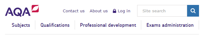
The full header has fixed AQA links and is used to merge pages into the main AQA structure. It has been designed for all view ports.
Desktop view
The desktop layout has four primary navigation links, 3 secondary links, plus a search field and is totally fluid in layout.
Example
Tablet view
The tablet view maintains the overall layout of the desktop view and saves space by allowing the primary navigation links to slide beneath the logo. The logo does not contain a strapline.
Example
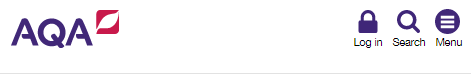
Mobile view
The mobile view has a simplified layout with 3 basic buttons for login, menu and search. Menu opens an off-canvas menu and Search drops down when needed. The logo does not contain a strapline.
Example
Simple header
The simple header is used for applications focusing around user profile and login status information.
Example

Footer
There are two kinds of footer: full and simple.
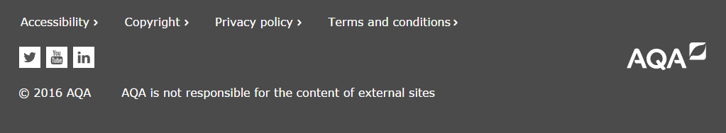
Full footer
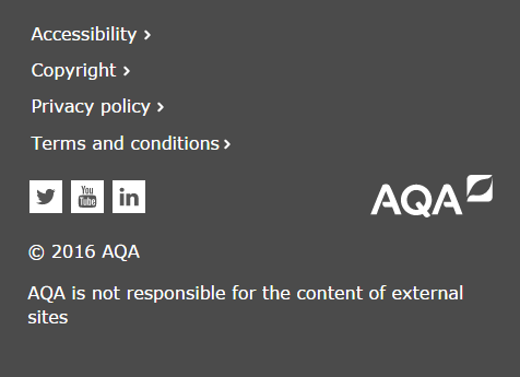
This consists of links to key pages including contact details, social media icons and the AQA logo. There is also a copyright notice.
It has been designed for all view ports and increases in height as more links are added - these appear as extra rows.
Desktop and tablet view
Example
Mobile view
The mobile view stacks its contents vertically in one column to save space.
Example
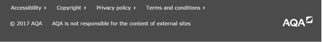
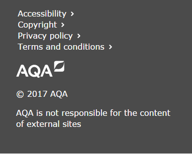
Simple Footer
A simple footer has been developed for non-customer facing applications. Social media icons have been removed to reduce the overall height.
Desktop and tablet view
Example
Mobile view
The mobile view stacks its contents vertically in one column to save space.
Example
Logo
The AQA logo appears in the header and footer. Both use responsive .svg images.
Header
The header logo is shown in full colour on the left and on a white background.
Desktop view
On desktop (64 to 90em) and desktop ‘+’ sizes (>90em) the header logo includes the ‘Realising potential’ strapline and is represented at its largest size (8.56rem).
Example
Tablet and mobile view
On mobile (<40em) and tablet (40em to 64em) sizes, the header logo is smaller than desktop (6.75rem wide) and the strapline is not included. It should have a 1rem margin above and to the left.
Example
Footer
The footer logo is white and sits on the 'black grey' coloured background.
Desktop, tablet and mobile view
The logo is displayed in a consistent size and position across all devices. It has no strapline and is slightly smaller than the tablet version (6rem). It should be right justified and have a 1.7rem border to the right.
Example