Navigation
Navigation styles, guidelines and examples are given on this page.
Due to the large amount of content on our website we use two forms of navigation: primary and secondary.
Primary navigation
Primary navigation provides access to the main content sections. It helps to orient the user to their surroundings. It's displayed horizontally at the top of the page.
In the selected state text is colour Primary (Purple) and underlined. In the rollover state text remains colour Primary (Purple) and underlined but also has a background box of colour Lightest grey.
Example

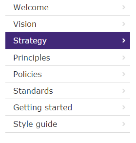
Secondary navigation
Secondary navigation is more specific than the primary navigation. It's displayed vertically on the left of the page.
In the selected state the text and arrow are white and displayed in a background box of colour Primary (Purple). In the rollover state the text is underlined. The text and arrow are colour Secondary (Blue) and displayed in a background box of colour Lightest blue.
Example - desktop and tablet
In desktop and tablet form the navigation is permanently on display.
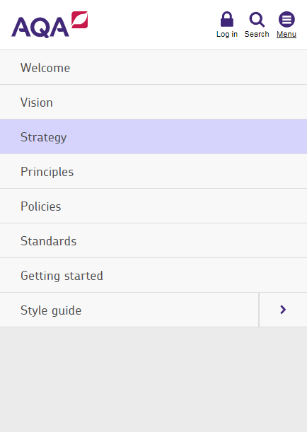
Example - mobile
On mobile screens the secondary navigation is typically hidden until requested through an event.
Mobile menu demo
Breadcrumb
This is used to indicate a user’s location in the content hierarchy of the website. It's useful to orientate users who land on pages from an outside search.
The breadcrumb also reduces the number of steps needed to jump to higher level pages and may encourage users to further explore the site and reduce the bounce rate.
We've styled the breadcrumb so as not to be the dominant navigation and placed it in a predictable location below the primary navigation.
Example
Code example
      <nav class="c-breadcrumbs" role="navigation">
          <span class="rm">you are here</span>
          <ol class="c-breadcrumbs__ordered-list">
              <li class="c-breadcrumbs__ordered-list__item c-breadcrumbs__ordered-list__item--first"><a class="c-breadcrumbs__ordered-list__item__link c-breadcrumbs__ordered-list__item__link--home" href="http://www.aqa.org.uk" title="Home">Home</a></li>
              <li class="c-breadcrumbs__ordered-list__item"><a class="c-breadcrumbs__ordered-list__item__link " href="../">Digital Service Manual</a></li>
              <li class="c-breadcrumbs__ordered-list__item"><a class="c-breadcrumbs__ordered-list__item__link " href="07-style.html">Style guide</a></li>
              <li class="c-breadcrumbs__ordered-list__item">Navigation</li>
          </ol>
      </nav>
Pagination
This style allows the user to page through information in an ordered way. It's used to view results from a search query or for large amounts of tabular data. The number of selectable pages depends on the amount of available content.
An active blue arrow indicates more content is available. An inactive grey arrow indicates no more content is available. The selected page is highlighted in a blue square.
Example - Page one active, previous page arrow inactive
Code example
      <div class="c-pagination">
      <ul class="c-pagination__list">
      <li class="c-pagination__list__item">Page</li>
      <li class="c-pagination__list__item">
      <a class="c-pagination__list__item__link c-pagination__list__item__link--page--prev is-inactive" href="#"></a>
      </li>
      <li class="c-pagination__list__item">
      <a class="c-pagination__list__item__link c-pagination__list__item__link is-active" href="#">1</a>
      </li>
      <li class="c-pagination__list__item" >
      <a class="c-pagination__list__item__link" href="#">2</a>
      </li>
      <li class="c-pagination__list__item" >
      <a class="c-pagination__list__item__link" href="#">3</a>
      </li>
      <li class="c-pagination__list__item" >
      <a class="c-pagination__list__item__link" href="#">4</a>
      </li>
      <li class="c-pagination__list__item" >
      <a class="c-pagination__list__item__link" href="#">5</a>
      </li>
      <li class="c-pagination__list__item" >
      <a class=" c-pagination__list__item__link c-pagination__list__item__link--page--next"   href="#" title="next page"></a>
      </li>
      </ul>
      </div>
Example - Page three active, previous and next page arrows active
Code example
<div class="c-pagination">
      <ul class="c-pagination__list">
        <li class="c-pagination__list__item">Page</li>
        <li class="c-pagination__list__item">
          <a class="c-pagination__list__item__link c-pagination__list__item__link--page--prev" onclick="return false;" title="previous page" href="#"></a>
        </li>
        <li class="c-pagination__list__item">
          <a class="c-pagination__list__item__link" href="#">1</a>
        </li>
        <li class="c-pagination__list__item" >
          <a class="c-pagination__list__item__link" href="#">2</a>
        </li>
        <li class="c-pagination__list__item" >
          <a class="c-pagination__list__item__link c-pagination__list__item__link is-active" href="#">3</a>
        </li>
        <li class="c-pagination__list__item" >
          <a class="c-pagination__list__item__link" href="#">4</a>
        </li>
        <li class="c-pagination__list__item" >
          <a class="c-pagination__list__item__link" href="#">5</a>
        </li>
        <li class="c-pagination__list__item" >
          <a class=" c-pagination__list__item__link c-pagination__list__item__link--page--next" onclick="return false;" href="#" title="next page"></a>
        </li>
      </ul>
      </div>
Example - Page five active, next page arrow inactive
Code example
<div class="c-pagination">
      <ul class="c-pagination__list">
      <li class="c-pagination__list__item">Page</li>
      <li class="c-pagination__list__item">
      <a class="c-pagination__list__item__link c-pagination__list__item__link--page--prev" onclick="return false;" title="previous page" href="#"></a>
      </li>
      <li class="c-pagination__list__item">
      <a class="c-pagination__list__item__link" href="#">1</a>
      </li>
      <li class="c-pagination__list__item" >
      <a class="c-pagination__list__item__link" href="#">2</a>
      </li>
      <li class="c-pagination__list__item" >
      <a class="c-pagination__list__item__link" href="#">3</a>
      </li>
      <li class="c-pagination__list__item" >
      <a class="c-pagination__list__item__link" href="#">4</a>
      </li>
      <li class="c-pagination__list__item" >
      <a class="c-pagination__list__item__link c-pagination__list__item__link is-active" href="#">5</a>
      </li>
      <li class="c-pagination__list__item" >
      <a class=" c-pagination__list__item__link c-pagination__list__item__link--page--next is-inactive" href="#" title="next page"></a>
      </li>
      </ul>
      </div>
Previous and next buttons
Previous and Next buttons to go from one subject to the next page in sequence
Back to top
A button appears in the bottom right hand corner of the screen when a user scrolls on a long page. It links to the top of the page. It's removed when the user navigates to the top of the page.
Example
See the button in the bottom right hand corner of the screen.
Code example
<a id="js-back-to-top" class="c-btn--back-to-top" href="#" title="back to top"></a>Dropdowns
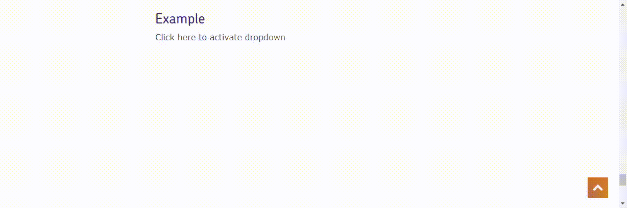
Dropdowns are used so the user can open a menu and select from a range of list elements. Toogle the class is-active to hide and show the dropdowm
Example
This shows open dropdown menu
Demo
    <div class="c-dropdown is-active" id="dropdown">

        <ul class="c-dropdown__list">
            <li class="c-dropdown__list__item">
                <a class="c-dropdown__list__item__link">Link 1</a>
            </li>
            <li class="c-dropdown__list__item">
                <a class="c-dropdown__list__item__link">Link 2</a>
            </li>
            <li class="c-dropdown__list__item">
                <a class="c-dropdown__list__item__link">Link 3</a>
            </li>
            <li class="c-dropdown__list__item">
                <a class="c-dropdown__list__item__link">Link 4</a>
            </li>
            <li class="c-dropdown__list__item">
                <a class="c-dropdown__list__item__link">Link 5</a>
            </li>
            <li class="c-dropdown__list__item">
                <a class="c-dropdown__list__item__link">Link 6</a>
            </li>
        </ul>

      </div>