Media
Guidelines and examples of implementation of the various types of media are explained on this page.
Responsive images
We follow this responsive image solution to optimise the display of images across different devices and screen sizes.
Image usage
SVG
- good for images with blocks of colour like icons and logos
- small in size
- scalable - doesn’t look blurred on devices with high pixel density – will not become fuzzy
- can change attributes in CSS image editor
- supported in many browsers
- supports transparency
Example
JPG
- best for photographic imagery and can support millions of colours
- supports file size compression
- very well supported across web
- small file size
Example

PNG
- good for images or icons placed on different coloured backgrounds or more complex images that require transparency
- png-24 has 32 million available colours which can support photographic levels of detail (but there is a file size overhead over JPG)
- multi-level transparency
Example

How to save images examples
SVG
Using Illustrator:
- save as ‘.svg’
- use svg profile 1.1
How to further optimise SVGs.
JPG
Using Photoshop:
- select 'Save for web'
- select .jpg option
- use the Progressive option – image loads in layers, each of higher quality
PNG
Using Photoshop:
- select 'Save for web'
- select the png-24 option and multi-level transparency allowing it to overlay different background colours
- use the Interlaced option (this is like progressive for jpg)
- optimise images where possible with Optimizilla
How to display images
The following CSS should be used to control the image display size:
- The max-width property is set to 100%. This allows the image to adjust to the Flexbox grid layout until it reaches its maximum display size.
- The height property is set to auto to preserve the aspect ratio of the image.
Code example
img {
    max-width: 100%;
    height: auto;
}
Text in images
- no text in images where possible for accessibility reasons
- if text has to be used, it must only be placed on an opaque background
- level AA WCAG 2.0 requires a contrast ratio of 4.5:1
Example
Incorrect image containing text directly on top

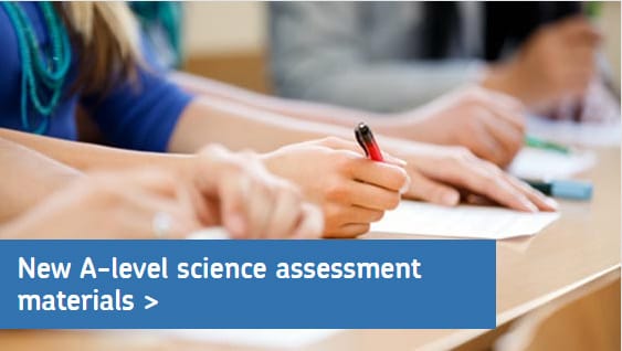
Correct image containing text on an opaque background
Video
There are two preferred methods for displaying video: iframe and HTML5.
iframe video
We use an iframe to show YouTube content. Read more about iframe video content.
To allow for lazy loading add the parameter
loading="lazy"Example of iframe video
Code example
<div class="o-media o-media__video">
  <iframe src="your.youtube.video" frameborder="0" gesture="media" allowfullscreen loading="lazy"></iframe>
</div>
HTML5 video
A <video> element is used for playing html5 videos or movies. Read more about HTML5 video content.
Example
Code example
<video controls>
  <source src="your.mp4" type="video/mp4">
  <source src="your.ogg" type="video/ogg">
  Your browser does not support HTML5 video.
  <track src="your.vtt" label="English subtitles"
  kind="subtitles" srclang="en" default> </track>
</video>
Audio
We use the HTML5 <audio> element to play audio files.
HTML5 audio
Read more about html 5 audio content.
Example
Code example
<audio>
  <source src="your.ogg" type="audio/ogg">
  <source src="your.mp3" type="audio/mp3">
  Your browser does not support the audio element.
</audio>
Podcasts
Exam marking: planting seeds to hit the mark
Series two
Episode seven | 3 February 2020