Modals
Modals are used to draw a user’s attention to a task or component by highlighting it in a box on a contrasting background which overlays the main web page. The modal remains active and focused until the user closes the modal – nothing else can proceed.
Typical uses are when the user has to make an important decision before moving on, or expanding a data table into a larger viewing area.
Dialog box
Example html
Log out
Are you sure you want to log out?
Code example
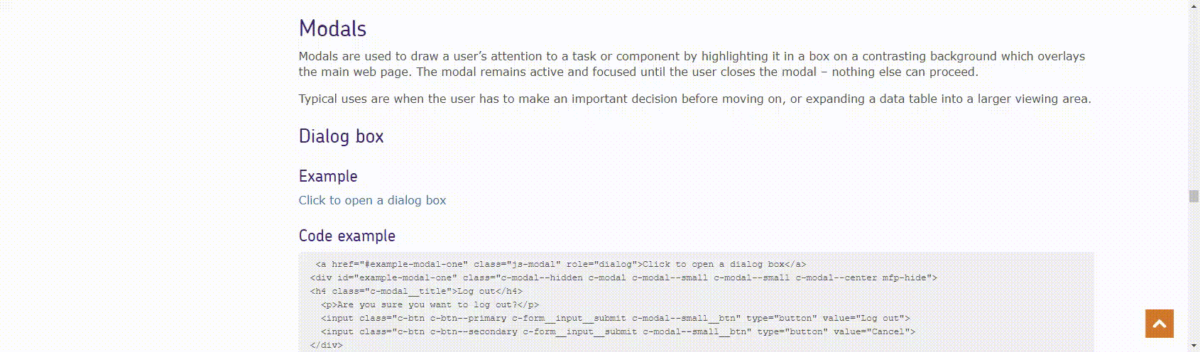
<a href="#example-modal-one" class="js-modal" role="dialog">Click to open a dialog box</a>
<div id="example-modal-one" class="c-modal--hidden c-modal c-modal--small c-modal--small c-modal--center mfp-hide">
        <h4 class="c-modal__title box-row">Log out <span class="col-xs last-xs c-icon c-icon--right c-icon--large c-icon__cross--blue"></span></h4>
        <p>Are you sure you want to log out?</p>
        <input class="c-btn c-btn--primary c-form__input__submit c-modal--small__btn" type="button" value="Log out">
        <input class="c-btn c-btn--secondary c-form__input__submit c-modal--small__btn" type="button" value="Cancel">
</div>